BE@RBRICK Fundamentals: What It Is and Why It Took Off
BE@RBRICK is a highly adaptable, bear-shaped artistic platform produced by Japan’s Medicom Toy. Since the debut of the first figure on May 27, 2001, it has evolved from a simple toy into a global cultural icon. By merging limited-edition scarcity with high-profile collaborations—ranging from street artists to luxury fashion houses—BE@RBRICK successfully blurred the line between pop culture and fine art collectibles. Its minimalist form, composed of nine standardized parts, serves as a “blank canvas” for infinite material and graphic expression.
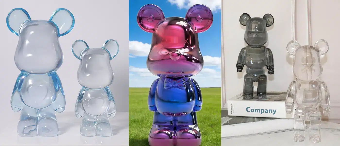
In the context of interior design, understanding the standardized scale is the first step in spatial planning. The three primary sizes used in modern interiors remain consistent across all reputable documentation:
100% (≈ 7 cm / 2.75 in): The baseline size, ideal as a subtle accent for bookshelves or desk vignettes.
400% (≈ 28 cm / 11 in): The most versatile scale for interior styling; it commands attention on consoles without overwhelming the room.
1000% (≈ 70 cm / 27.5 in): A flagship scale that functions as a floor-standing sculpture or a spatial anchor with a strong gallery-like presence.
Style Mappings: Integrating BE@RBRICK into Nordic, Industrial, and Wabi-Sabi Interiors
1. Nordic: Restraint and Material Warmth
In Nordic interiors, characterized by pale woods, matte whites, and a restrained palette, the goal is seamless cohesion. The BE@RBRICK should not “shout” but rather sit comfortably within the room’s soft geometry.
Integration Strategy: Opt for a 400% figure in a natural wood finish (like the Karimoku collaborations) or a subtle matte monochrome. Place it on a sideboard or a low oak console to maintain a grounded feel.
The Vignette: Keep the arrangement calm—one figure paired with a single low vase and one art book is sufficient.
Pro Tip: Maintain negative space equivalent to 1 to 1.5 times the figure’s width on each side. This ensures the silhouette breathes and doesn’t clutter the clean Scandinavian lines.
2. Industrial: Contrast and Reflective Edges
Industrial spaces—defined by exposed concrete, raw brick, and structural steel—require a crisp counterpoint. Here, the BE@RBRICK acts as a polished jewel against a rugged backdrop.
Integration Strategy: A chrome or metal-plated finish works best here, mirroring the surrounding raw materials. A 400% size on a metal console creates a sharp focal point, while a 1000% figure on a simple concrete plinth can effectively anchor a room’s corner.
Visual Control: Limit the surrounding color palette to a maximum of three tones. This prevents “visual noise” from competing with the figure’s high reflectivity.
Circulation: Ensure floor-standing pieces are kept clear of main walking paths to preserve the functional, open-plan feel of industrial lofts.
3. Wabi-Sabi: Asymmetry and Quiet Presence
Wabi-Sabi centers on imperfection, patina, and the beauty of things as they are. Integrating a BE@RBRICK into this aesthetic requires a focus on shadow and atmosphere rather than the object itself.
Integration Strategy: Use a wood-finished or clear (translucent) BE@RBRICK. The clear variant, in particular, reads as almost weightless, allowing the texture of the wall behind it to remain visible.
Lighting as a Tool: Place the figure where soft, indirect light grazes a textured plaster or stone wall. Let the play of shadows define the form.
The Philosophy of Less: Avoid busy graphics or high-contrast patterns. The calm of the form and the purity of the finish should carry the scene, allowing “emptiness” (Ma) to do part of the talking.
Collaborations Matter (And How They Inform Styling)
The core appeal of BE@RBRICK lies in how its minimalist silhouette acts as a blank canvas for culture. The figure itself doesn’t dictate a room’s aesthetic; rather, the DNA of the collaboration determines its visual impact and styling strategy.

Here is how different iconic collaboration types dictate practical interior styling:
High-End Luxury (e.g., Chanel Coco Chanel 1000%)
Cultural Context: The 2006 Chanel edition marked the platform’s crossover into top-tier luxury.
Styling Advice: Typically featuring classic monochrome or haute couture elements, these exude elegance and restraint. They thrive in modern minimalist or Parisian-inspired spaces, requiring ample negative space (gallery style) to highlight their scarcity and premium feel.
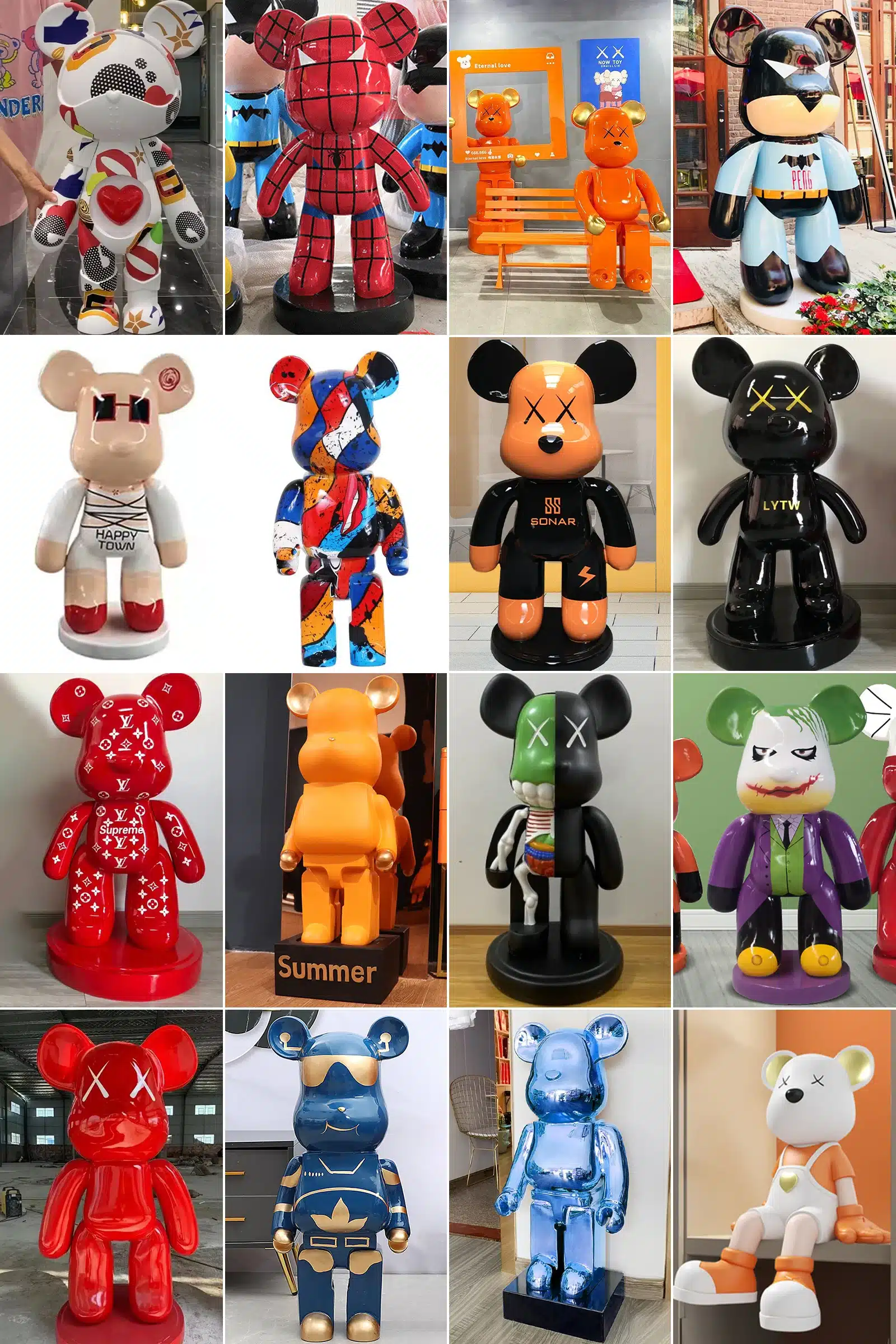
Contemporary Pop Art (e.g., KAWS Dissected Companion)
Cultural Context: Brings museum-grade pop aesthetics and anatomical concepts into the collectible toy space.
Styling Advice: Carries immense visual impact and subcultural weight. Perfect for Industrial spaces, easily grounding raw concrete floors or rugged metal display stands.
Classic Art Masters (e.g., Van Gogh / Jean-Michel Basquiat)
Cultural Context: World-renowned paintings wrap the figure using water-transfer printing, offering rich, complex color palettes.
Styling Advice: Visually dense. Treat it as a three-dimensional painting. Surrounding furniture and decor must be extremely simplified against a monochromatic background. Use top spotlights or soft side lighting to emphasize the painted textures.
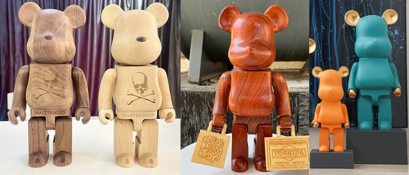
Streetwear & Material Pioneers (e.g., BAPE / Karimoku)
Cultural Context: BAPE brings high-saturation street camo, while Japanese furniture maker Karimoku represents the pinnacle of traditional woodcraft.
Styling Advice: High-energy streetwear collabs need cool or dark rooms to neutralize the palette. Conversely, the Karimoku wood editions are the ultimate answer for Nordic and Wabi-Sabi interiors, naturally providing the warmth of fine furniture without requiring extra styling support.
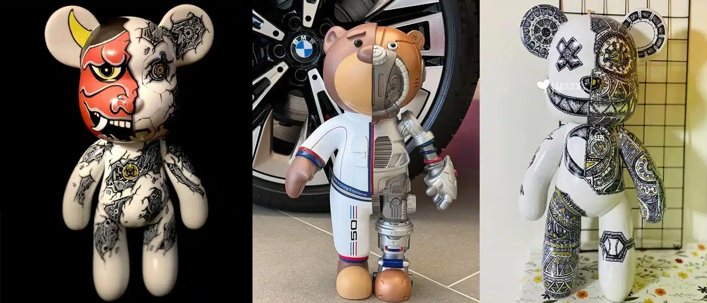
Futurism & Mechanical Aesthetics (e.g., Hajime Sorayama)
Cultural Context: Fuses Sorayama’s iconic “sexy robot” concept with the BE@RBRICK platform, utilizing an ultra-reflective chrome finish.
Styling Advice: The ultimate centerpiece for Industrial and ultra-modern spaces. It pairs perfectly with stainless steel, black marble, or dark concrete walls. Because the mirrored surface reflects its surroundings, keep the facing line-of-sight impeccably clean to avoid visual clutter.
Tactile Softness & Domestic Life (e.g., Gelato Pique)
Cultural Context: A partnership with the renowned Japanese loungewear brand, featuring flocked or plush finishes that completely neutralize the coldness of ABS plastic.
Styling Advice: Visually soft and relaxed. It is ideal for bedrooms, reading nooks, or areas anchored by large wool rugs. It slips effortlessly into Nordic interiors, effectively softening the room’s sharp architectural edges.
Cross-Generational Pop Icons (e.g., Star Wars / Daft Punk)
Cultural Context: Global film and music symbols rendered in highly accurate signature colorways.
Styling Advice: These pieces carry strong narrative weight. Darth Vader’s monochromatic presence suits high-contrast modern spaces, while Daft Punk injects a distinct retro-electronic or cyberpunk atmosphere into the room.
Styling Pitfalls: Avoiding Common Mistakes

Even with the right scale and finish, improper placement can disrupt room harmony. To maintain a sophisticated, gallery-like aesthetic, watch out for these common styling traps:
The “Toy Store” Effect (Overcrowding):
The Mistake: Lining up dozens of 100% or 400% figures shoulder-to-shoulder on a single shelf. This strips the figures of their sculptural quality and makes the space look cluttered and chaotic.
The Fix: Treat your collection as a rotating art exhibition. Display only a curated selection (a maximum of three to five pieces per unit) and store the rest. Rotate them seasonally to keep the space feeling fresh and intentional.
The Lighting Trap:
The Mistake: Placing figures under direct, harsh spotlights or right next to untreated windows.
The Fix: Direct UV light causes clear plastics to yellow and bright paints to fade, while harsh spotlights on chrome figures create blinding glare. Always utilize soft, ambient lighting or museum-quality LED strips inside display cabinets.
Context Clashing:
The Mistake: Placing a visually loud, graphic-heavy collaboration (like a neon streetwear piece) into a serene Wabi-Sabi corner without any visual transition.
The Fix: If you want to feature a bold piece in a quiet room, use a “bridge” element. A neutral-toned acrylic display case or a solid black/white plinth can frame the loud figure, cleanly separating it from the rustic background.